trite symbols
trite symbol~ peace
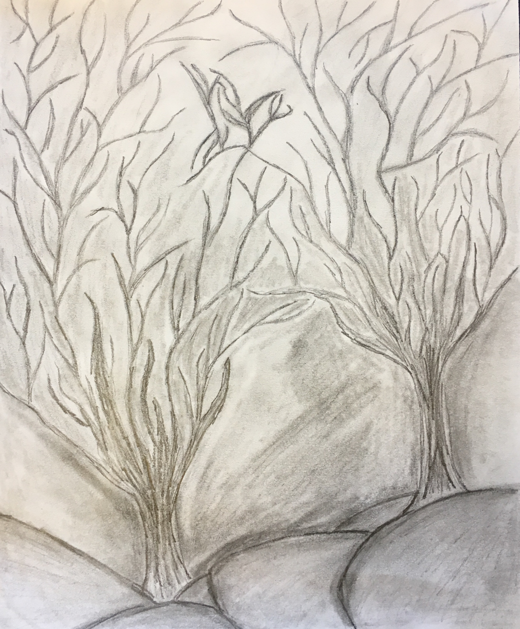
For this project I chose the trite symbol of peace. This is typically depicted by using a peace sign or a dove.
When I think of peace, my mind thinks of nature and the openness it has. I knew I wanted to somehow tie in nature into my project.
I originally planned to draw tree roots that somehow would intertwine and be connected, using that to symbol peace and togetherness. As I continued the drawing, I played with the orientation and decide to have the roots be branched instead.
In the middle of the drawing, the branches come together to make a loose symbol of a dove. I didn't want to make the symbol too obvious so then viewers would have to look at the piece longer to interpret it.
I chose to draw in pencil, making the image darker and more "spooky" because I wanted to symbolize the darkness around peace that we all strive for. There are a lot of hardships and challenges we have to overcome before we reach true tranquility and I think using the darker lines and pencil helps to show that.
Orignally I had the composition too light and I think adding in the darker lines helped make the artwork more successful and dynamic.
Overall, I'm pretty happy with how it turned out. If I had more time, I think I would have incorporated color into the background to make it a little less serious.
playing around with composition
prisma color
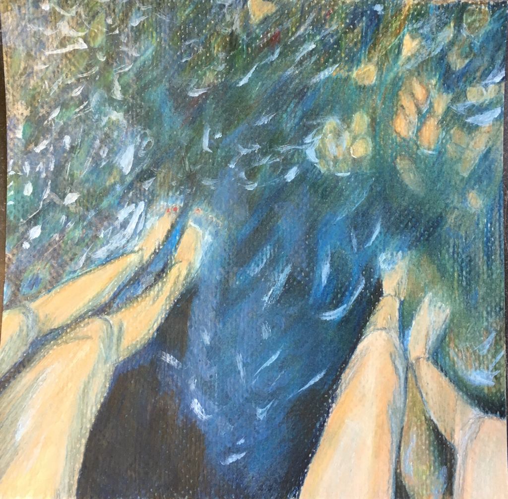
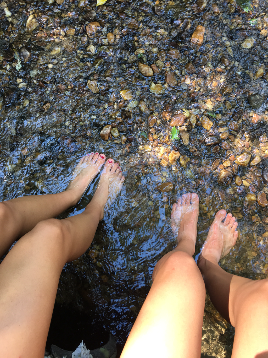
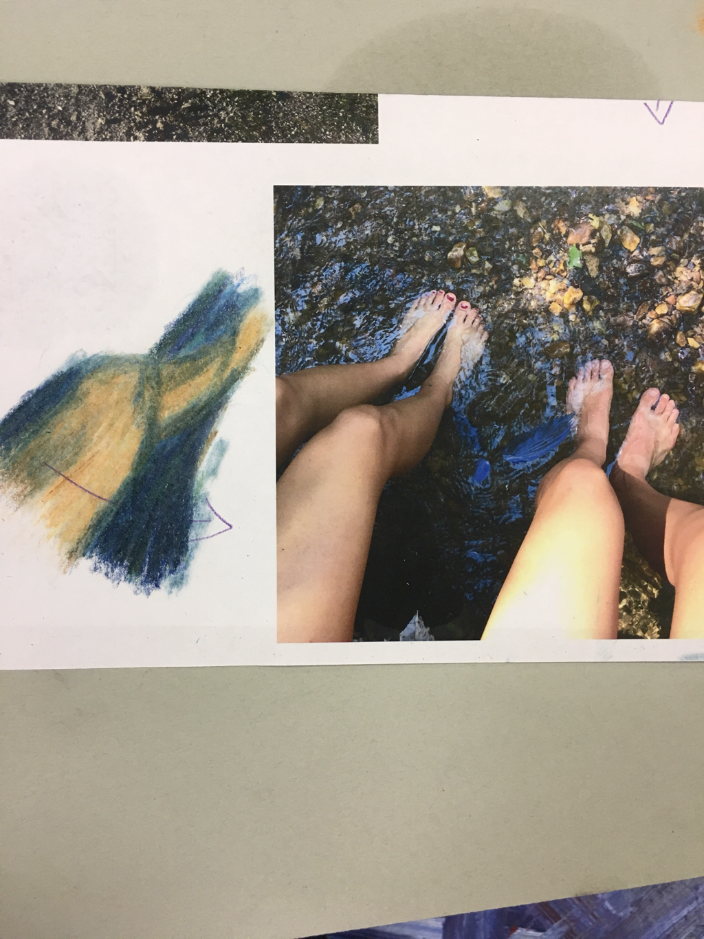
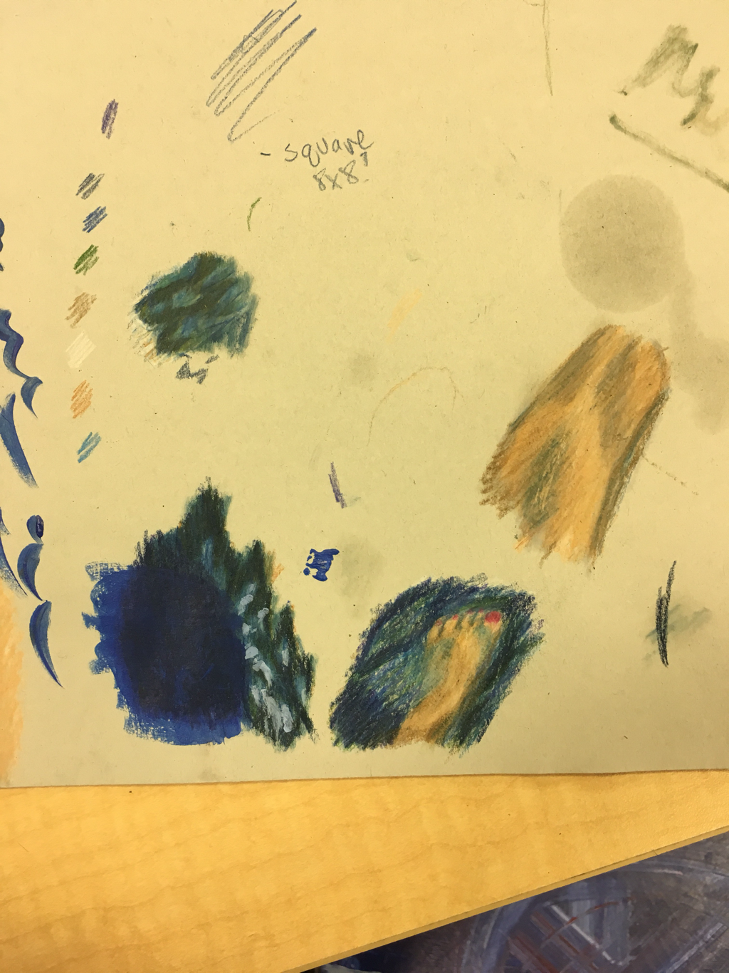
for this project I focused on adding texture and dimension with prisma color on the legs and the pebbles in the water. This reference photo I used made a big challenge for me because of the shadows and the shimmer of the water. It took me a while to firgure out the angles of the legs and making them look proportion despite the weird angles I had to work with. Overall, I'm pretty pleased with my first prisma drawing and liked the way it turned out. I think my favorite part about this piece is the legs because I normally have a really hard time drawing parts of the body.
i tried to stick with a few main colors in the drawing and pace myself when layering the colors. It was hard for me to stay patient when building up the colors. I ended up using baby oil to help blend the colors together and give the overall picture a more natural, smooth appearance. I also added paint in the very end to give the water a more shimmery and dimensional look.
i tried to stick with a few main colors in the drawing and pace myself when layering the colors. It was hard for me to stay patient when building up the colors. I ended up using baby oil to help blend the colors together and give the overall picture a more natural, smooth appearance. I also added paint in the very end to give the water a more shimmery and dimensional look.
planning/practice
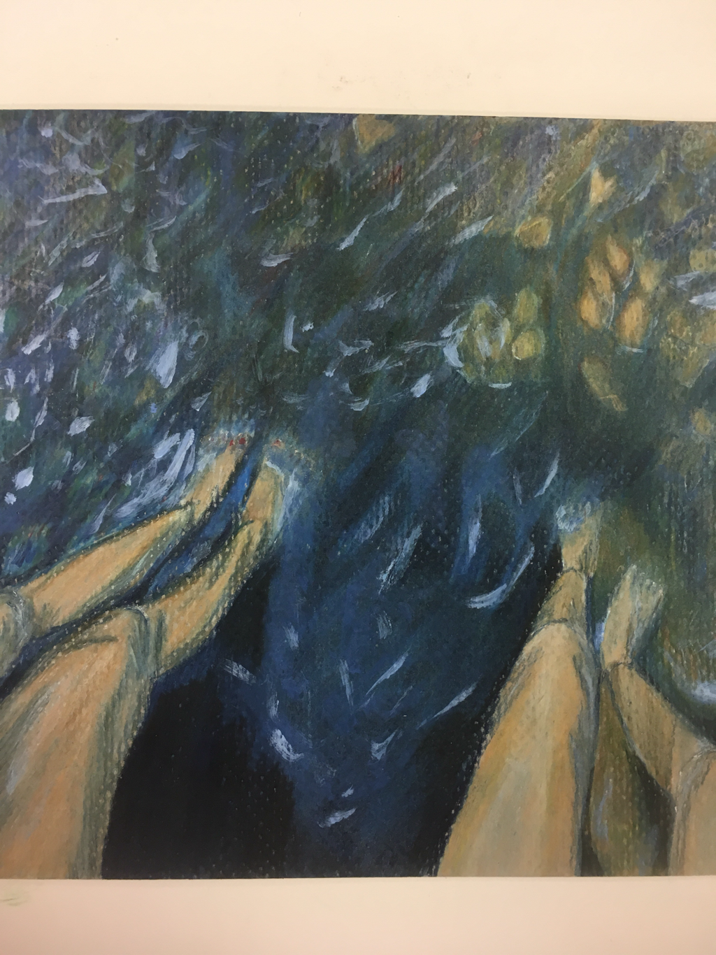
Oil painting
for this project, I chose to challenge myself and use oil paints for the first time. I've actually never painted anything in the traditional way so I had to work a lot with technique and blending colors. I wanted to create something where I could focus more on the elements of design rather than creating an actual picture focused on a topic. So I made something more abstract or nonobjective. Using the oil paint, I focused on the movement and colors of the paint brush and tried to blend them all together while still highlighting the individual colors I chose.
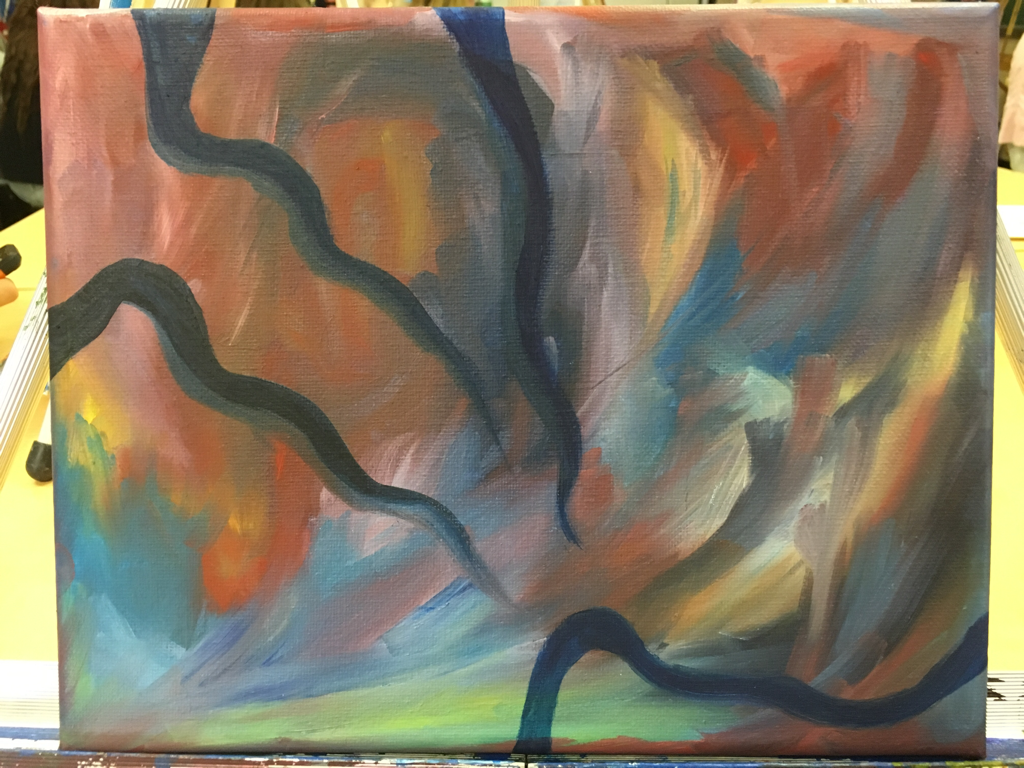
I like the movement of the piece and how your eyes are directed by the brush strokes. Overall, I'm content with my piece, but I wish I had planned more or maybe added something else to the work to make it more special.
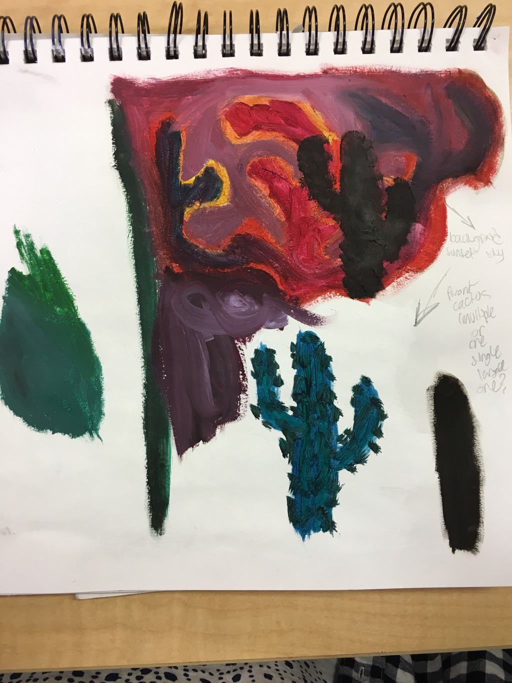
originally I planned to use the intense colors and brush strokes of the background as a sunset in the desert. I wanted to put some cactuses in the foreground. However, I decided against it because I liked the movement too much to cover it up with black silhouettes and instead I added squiggles in the dark blue to make the piece more interesting without taking away from the work I put into the background.
i learned that I definitely like the opportunities oil paint gives you over acrylic. In practice, I was frustrated with the fast dying of acrylic and I couldn't blend the colors as I wanted to in time. Oil gave me the ability to work slower and think through each stroke instead of having to rush through it.
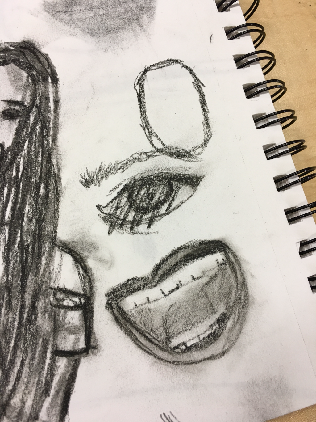
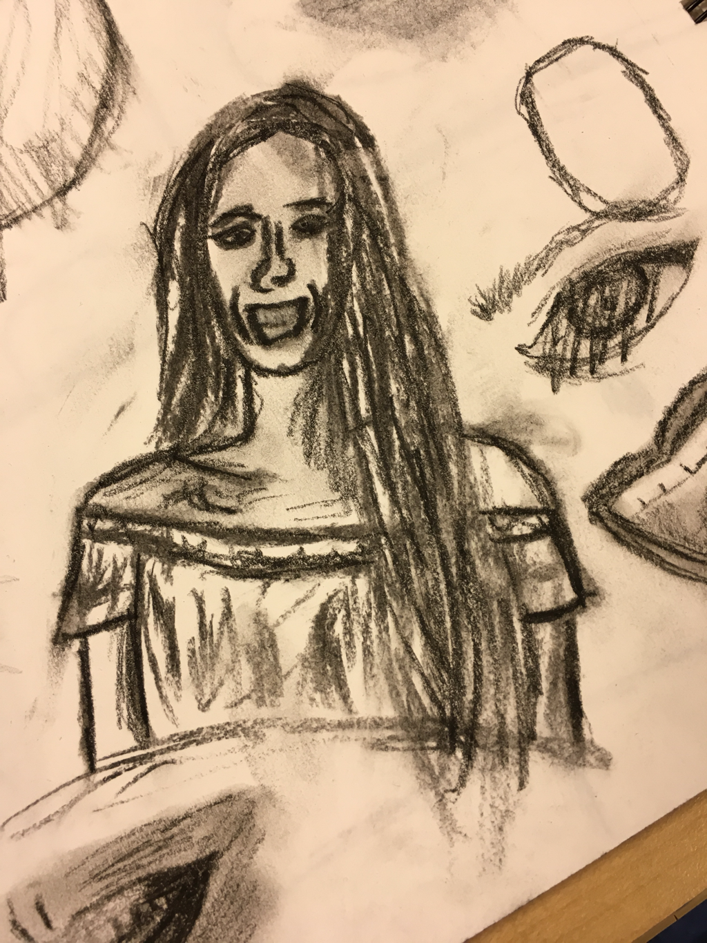
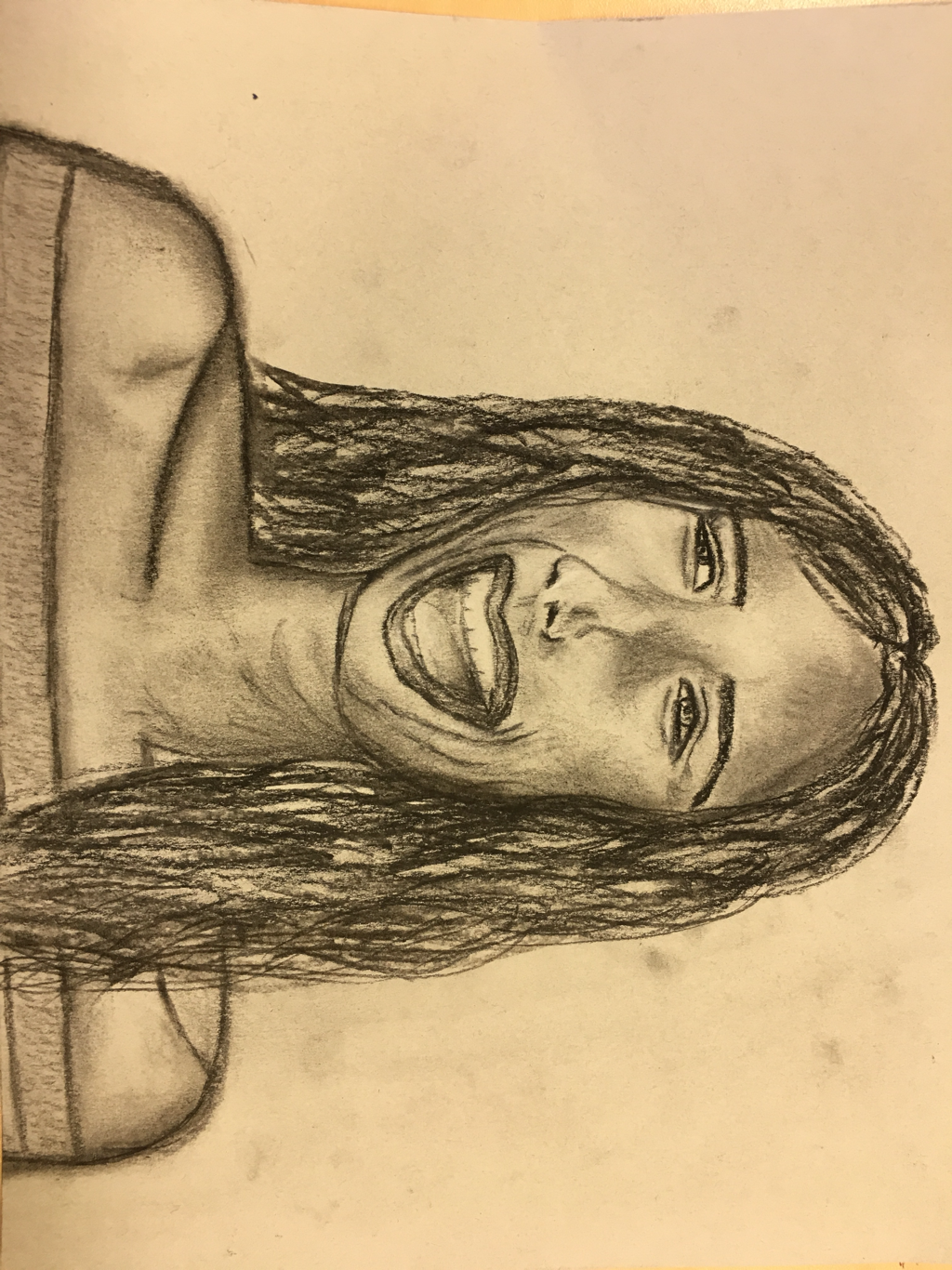
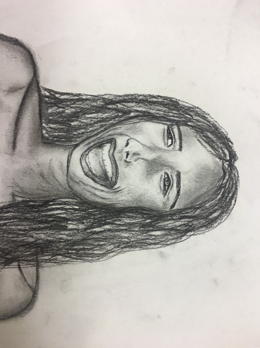
Figure Drawing
i was really nervous for this unit. Before, I had been able to get by without doing any drawings of people really in art class. In the end I was really happy that I pushed through and improved my skills with proportions and faces at different angles. Proportions were definitely the hardest part for me. I had a picture I knew I wanted to draw, but the angle of the face threw off everything I had learned prior. I had to adjust the way I looked at the photo and focus on a small part at a time and worry more about the shadowing to add detail in the picture. I think the mouth and the eyes were hardest for me to get as accurate as possible. I'm pretty pleased with how they turned out, although I definitely like the picture better from far away than up close (because I focus more on what I don't like about the picture when closer). I think I still need some improvement with proportions, particularly in the shape of the face.
practice and final
i also learned out to do hair finally, another thing I e been avoiding. This figure drawing unit forced me to work on my skills in figures that I've tried my hardest to stay away from. I found that charcol worked really well for me and helped me loosen up with my drawing.
FINAL POST
i think I learned a lot in art this year. I tried more mediums and definitely pushed myself to do the one thing I avoided all of art- drawing. I learned that charcoal and clay were my favorite mediums to work with, and probably my more successful ones I've used.
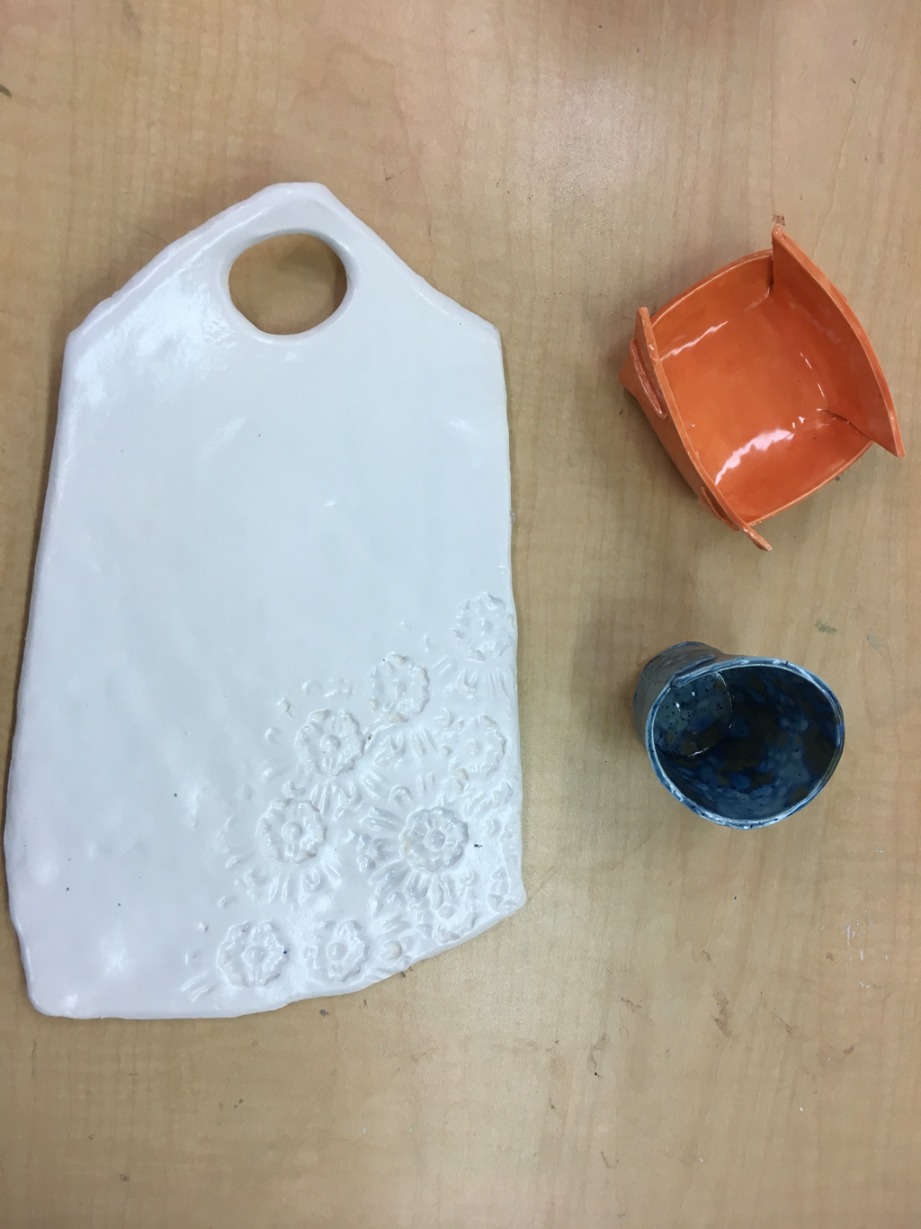
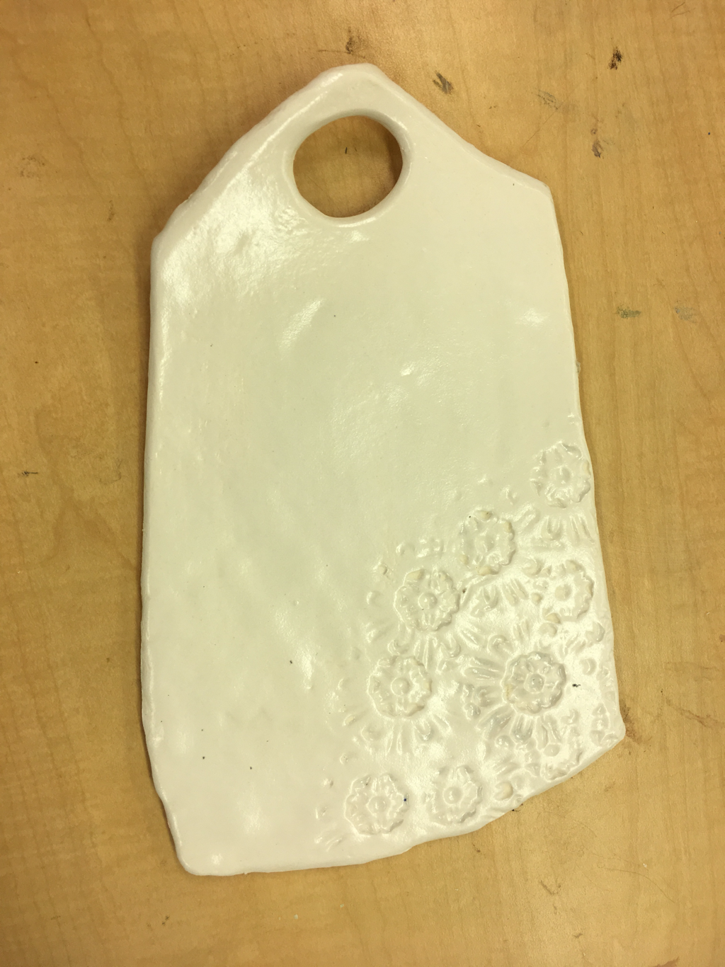
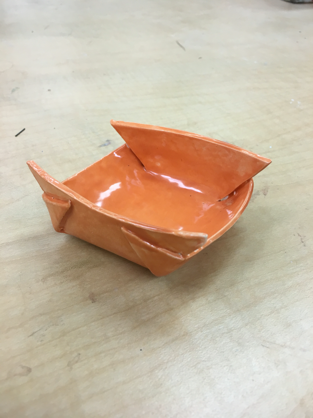
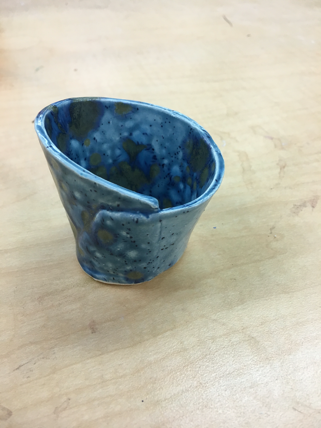
The ceramic stuff I made
Charcoal drawing
for me, the most challenge thing I've done this year is figure drawings and proportions. In the charcoal drawing (above) I had to learn to loosen up when drawing, and it helped me fix what was wrong with my piece. I drew the mouth countless times. Also, in my prisms drawing, I drew and redrew the the legs countless times. The lighting and shading was the hardest part for me on those
The prisma drawing
for my final project I only had the time to complete four pieces. I made three clay items; a succulent pot, a boxed-clay bowl, and a cheese board. I wish I had done more clay stuff in this class to grow more in this area. So I could see myself in the future picking it up as a hobby.
my last piece I made was a screen print design, which I printed on two shirts. I wanted to relate it to the next chapter of my life: college at Appalachian state, living in the mountains.

overall, I had so much fun in all of the art classes I have taken in high school (especially art 3!) I'm proud of the skills I've learned and I plan to continue growing as an artist (as a hobby) when I'm older. I'll miss art class with Mrs. Purtee of course!!
